
SCULPT for Accessibility
SCULPT for Accessibility is a beginners guide to raise basic awareness and skills for accessibility across the wider workforce.
What is SCULPT?
SCULPT came out of research to understand user needs and to address basic digital accessibility awareness and training requirements for a wider workforce approach.
The full journey to develop SCULPT can be read at AbilityNet Everyone can SCULPT for Accessibility.
SCULPT is a simple acronym and underlying framework to introduce the basic principles of digital accessibility in a bite-sized approachable way.
Using feedback, we have added to the original SCULPT model to cater for a much broader range of digital content beyond just documents.
SCULPT now stands for:
- S stands for structuring a document using headings
- C stands for colour contrast, colour use, captions and checkers for accessibility
- U is use of images and alt text
- L refers to links and logical reading order
- P is plain language and clear fonts
- T stands for tables and transcripts
SCULPT at Worcestershire County Council
This is how we use sculpt in our organisation:
- mandatory e-learning module for all new starters and existing staff to underpin basic awareness of digital accessibility and the SCULPT principles.
- SCULPT support area on our intranet with on-demand resources specific to each principle of SCULPT to assist staff in their everyday practice.
- bespoke learning sessions can be requested for service areas internally based on their specific needs
SCULPT also forms part of our Digital Accessibility Strategy and is embedded within our Equality, Diversity and Inclusion Strategy (PDF).
SCULPT can be adopted by anyone
We see SCULPT as a simple way to communicate some basic principles of digital accessibility and a starting point to shape inclusive practices. It was a finalist in four national awards during 2021 and 2022, including the AbilityNet Tech4Good Awards.
Anyone can use the SCULPT acronym to develop their own approach to digital accessibility. To get you started our posters and logos are free to download.
SCULPT has been acknowledged nationally:
Additionally, many other organisations have adopted and shared the SCULPT model, here are a small cross-section of examples:
- SCULPT for Accessibility University of Reading
- Accessible documents Cambridgeshire County Council
- SCULPT framework SportScotland
SCULPT is shared under a Creative Commons license. So, please do feel free to adopt it, all we ask is that you acknowledge us by using the text below or put a link directly back to this SCULPT for Accessibility webpage.
SCULPT by Helen Wilson is licensed under a Creative Commons Attribution-NonCommercial-ShareAlike 4.0 International Licence. Based on work at Worcestershire County Council.
Useful links
Download the SCULPT materials:
 Facebook
 X
X Email
Email WhatsApp
 Messenger
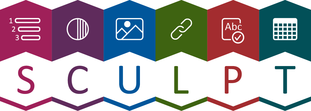